Available for projects
Hi, I'm Max Burnside.
I'm a designer who's been creating well-crafted products for over a decade.
-

Saks iOS App
-

Weiss Family Dentistry Branding
-

iOS App Settings Page
-

UserEvidence UX Components
-

Sync watchOS Workout Time with iOS...
-

Starbucks Drink Size Dropdown
-

Visably Marketing Site
-
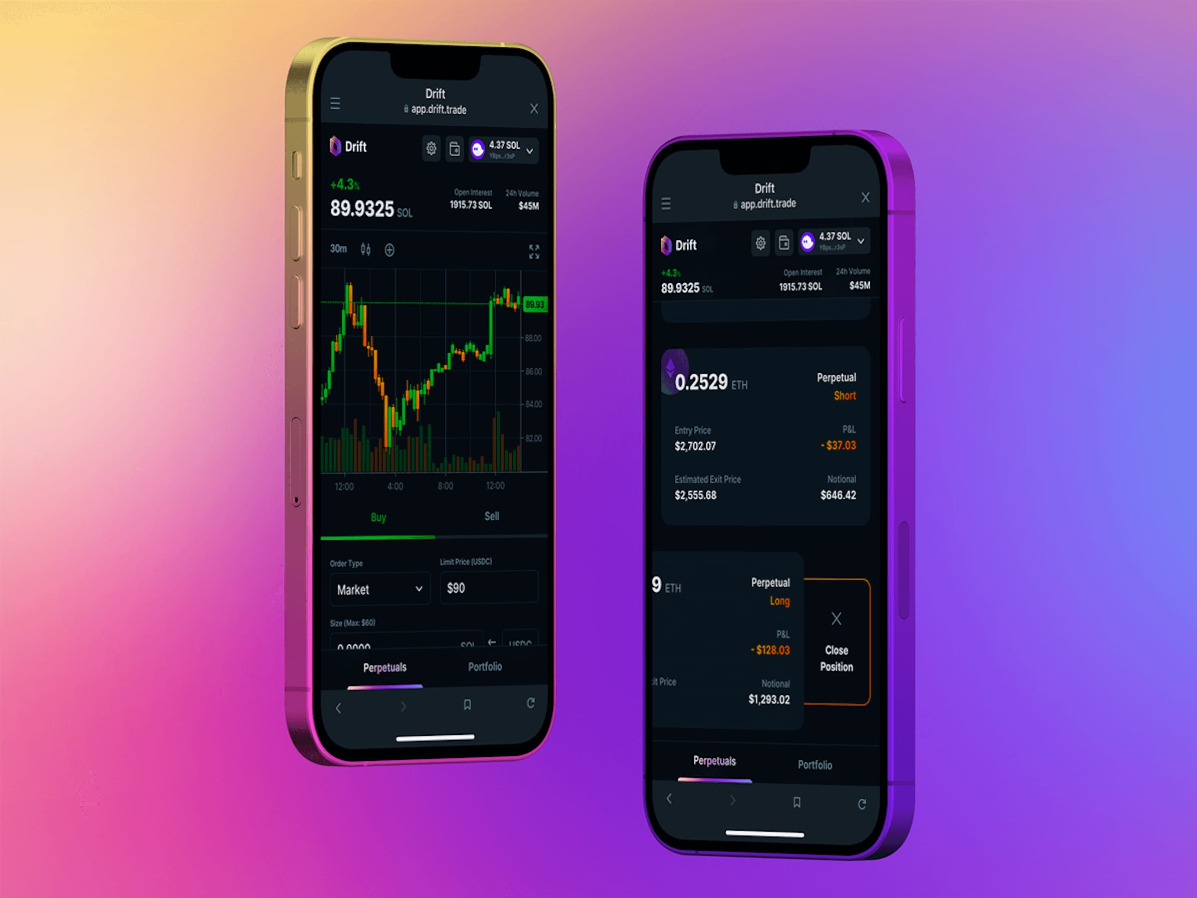
Drift Mobile Application
-

UserEvidence Surveys
-

Contentstack CMS Content Models
-

TRX Training Club Apps
-

Contentstack CMS Navbar Grid
-

Visably Pricing Page
-
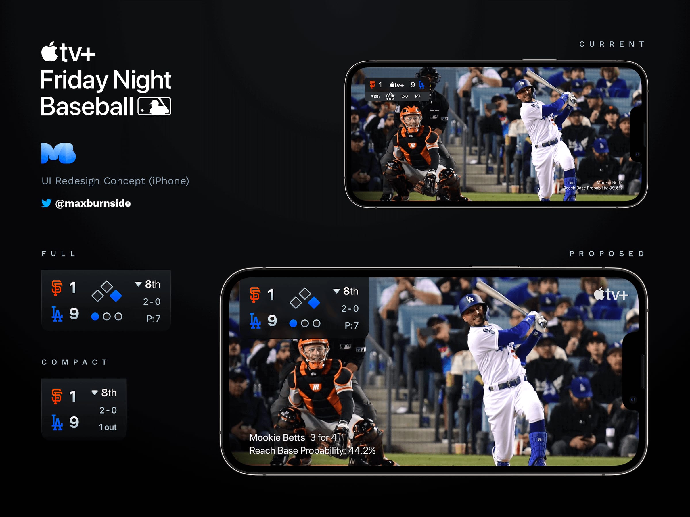
Apple TV+ Friday Night Baseball Redesign
-

Contentstack CMS Tasks
-

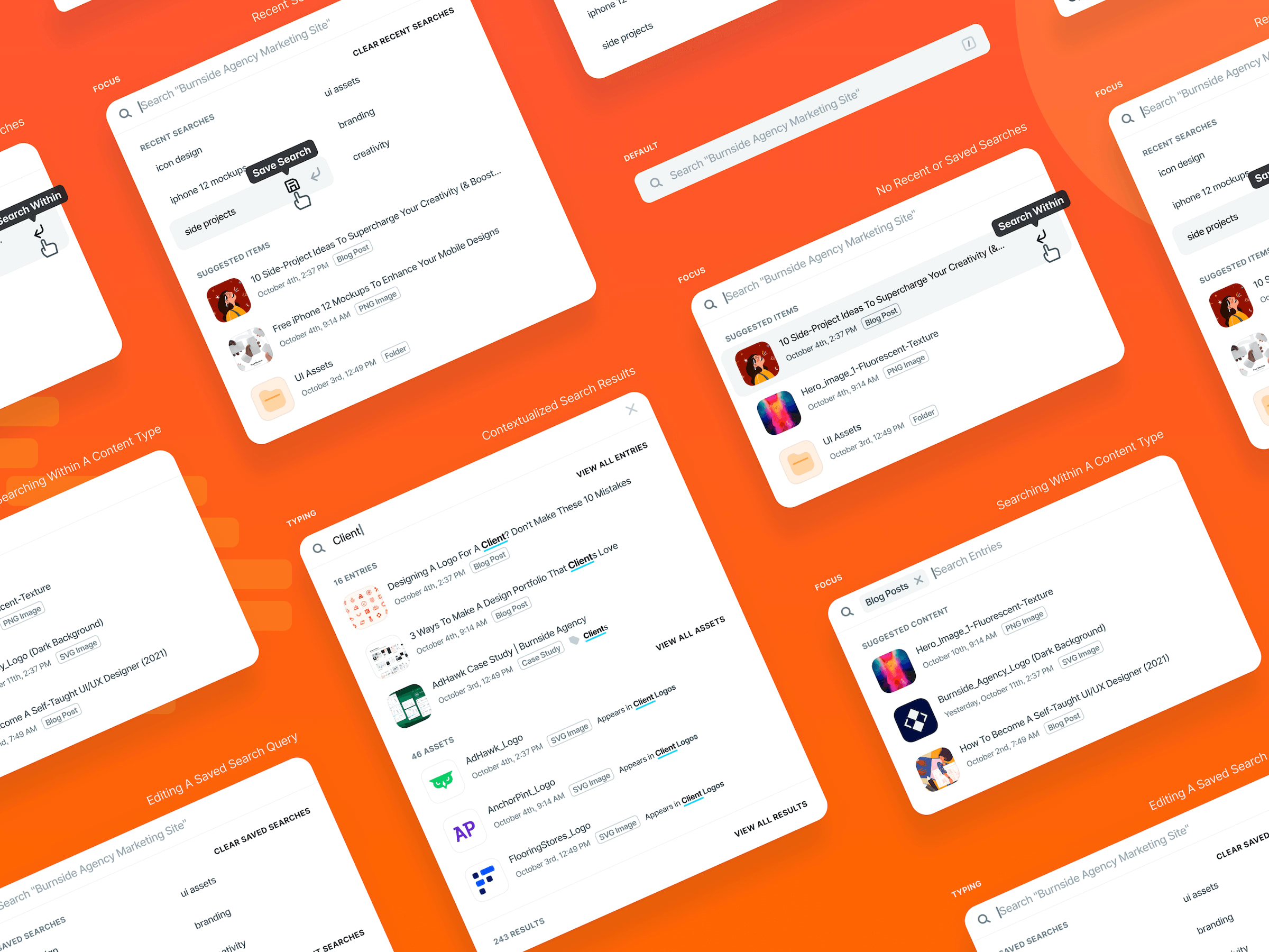
Contentstack CMS Contextualized Search
-
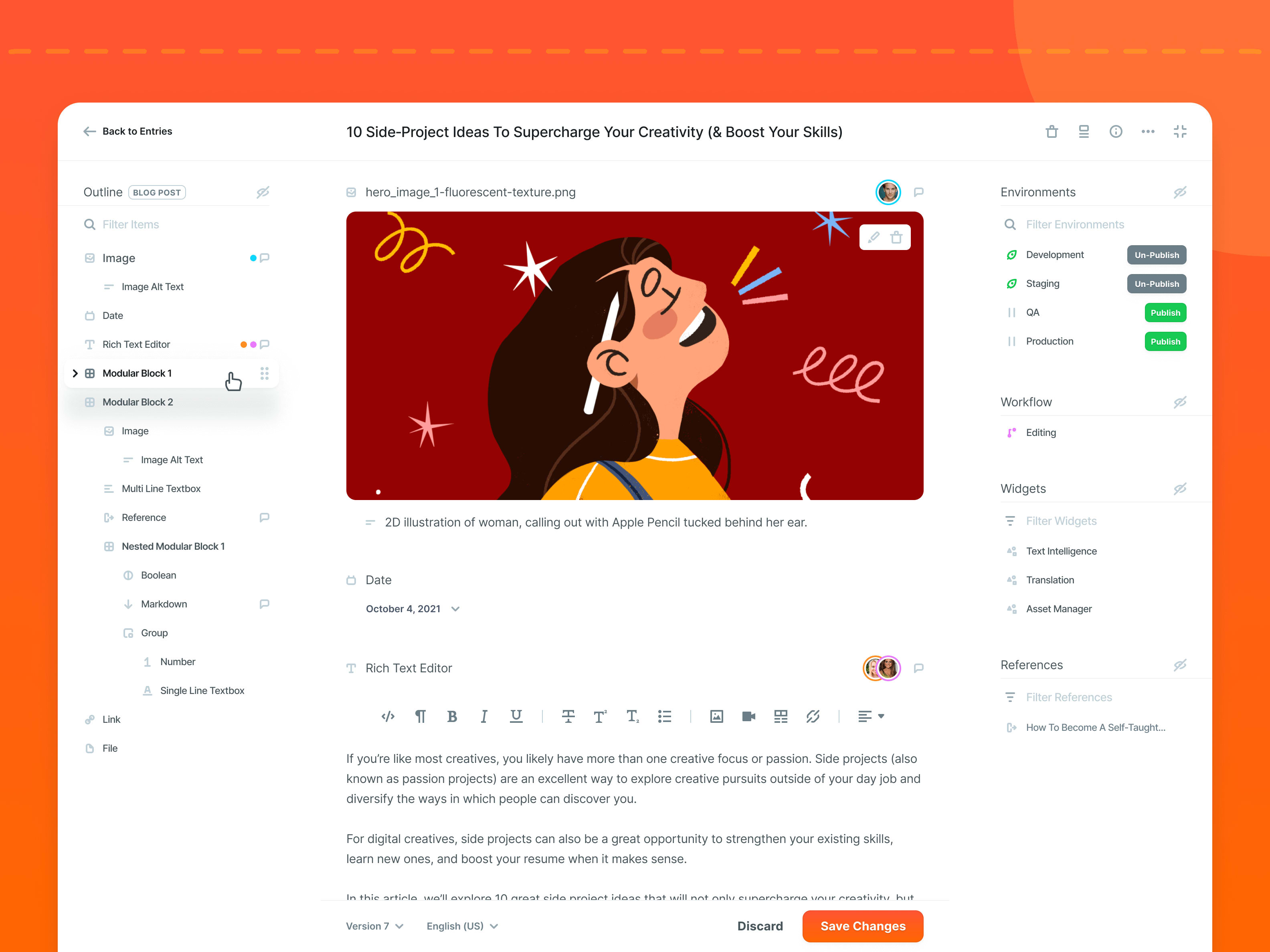
Contentstack CMS Entry Editor
-

AdHawk iOS Facebook Ads Dashboard
-
Contentstack CMS Search
-

AdHealth iOS App
-

FlooringStores Hero Illustration
-
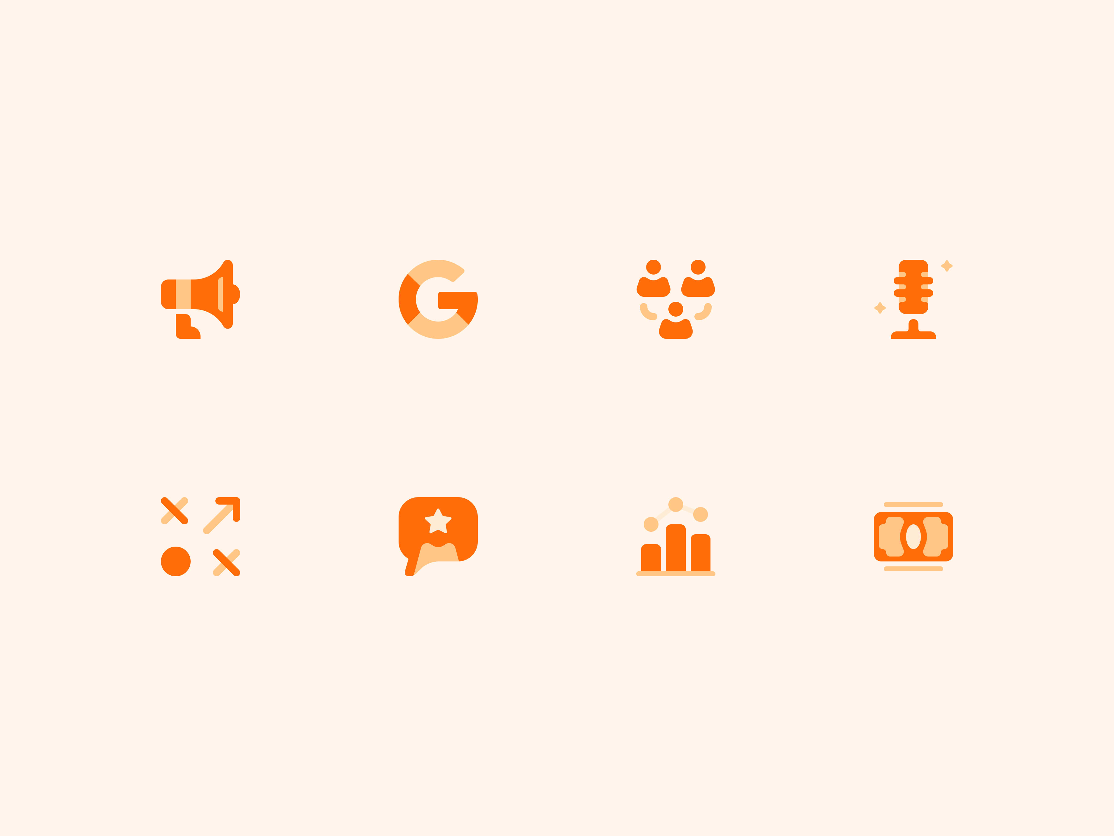
Purple Orange Services Icons
-
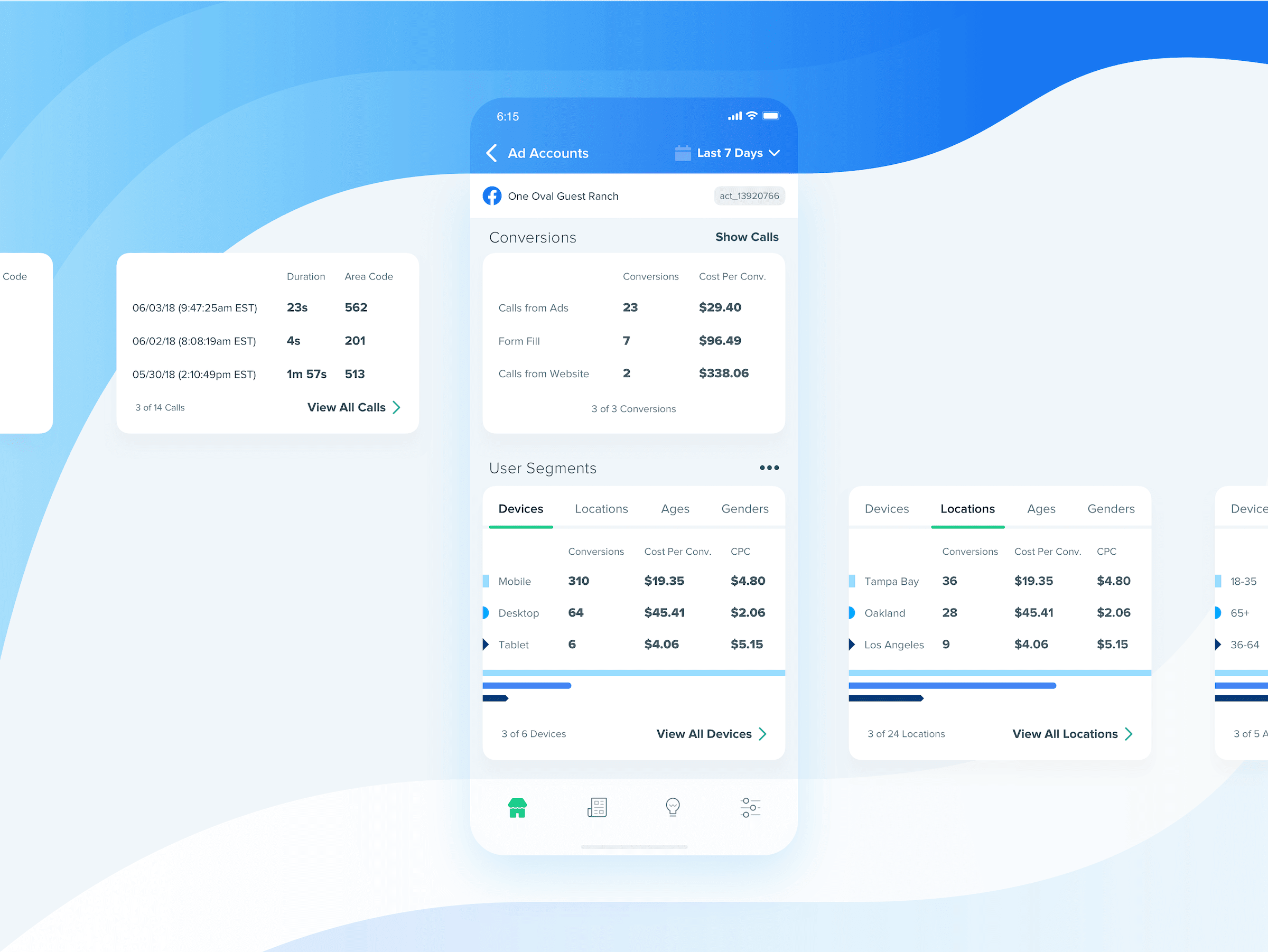
Facebook Ads Conversions & User Segments
-
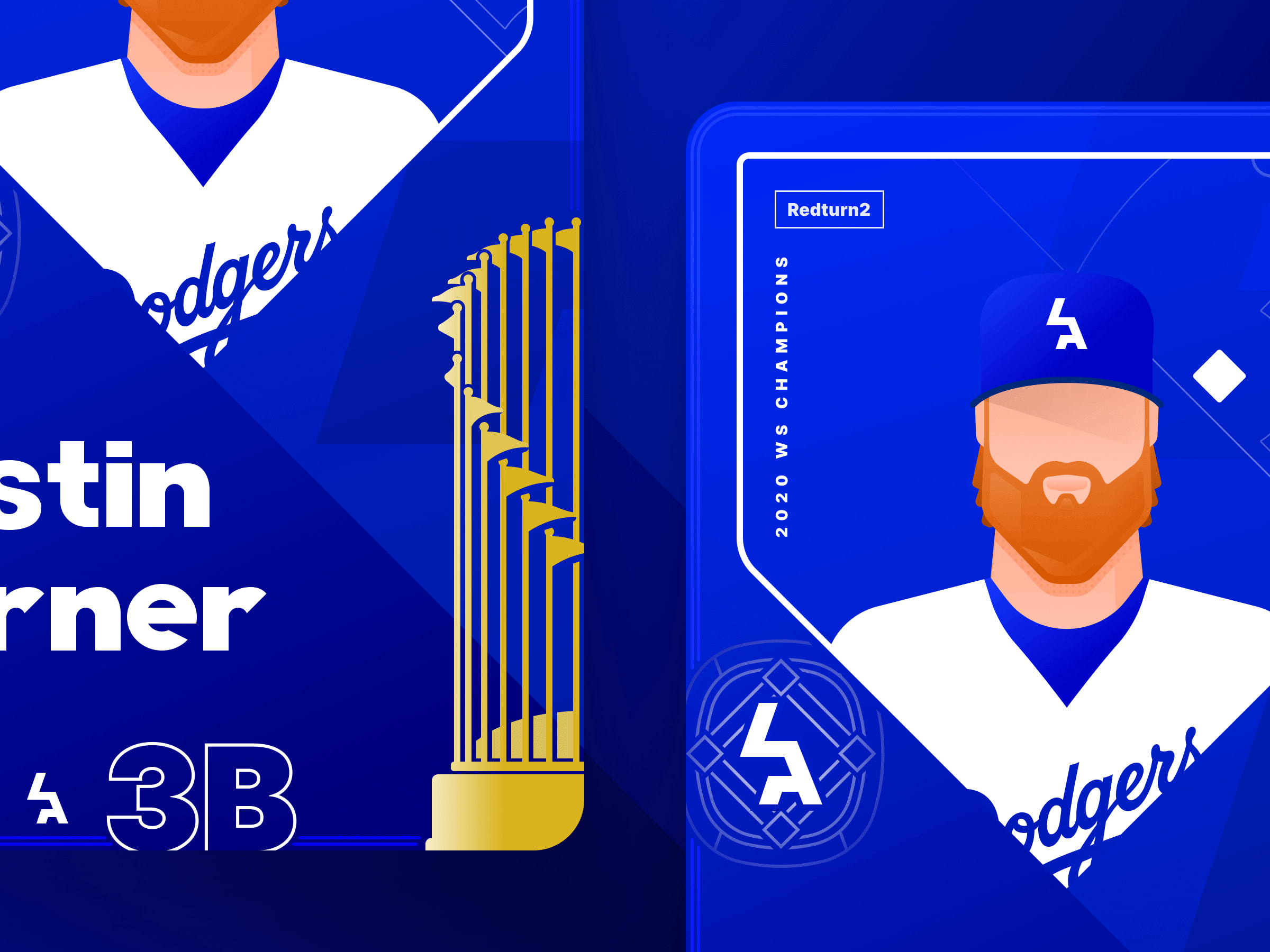
Dodgers 2020 World Series Baseball Cards